How to Use Variables to Create UI Packages in Figma

Variables are one of the most recent updates introduced to Figma. Variables in Figma store resuable values that can be applied to all kinds of design properties and prototyping actions. I think Figma's variables update takes UI design a step further than any other update. The main reason for this is that variables allow designers to prototype reusable design system. It allows building an interactive quiz that uses conditional logic and also creating complex prototyping flows. Before I share tips for using variables, let me first explain a few details about variables.
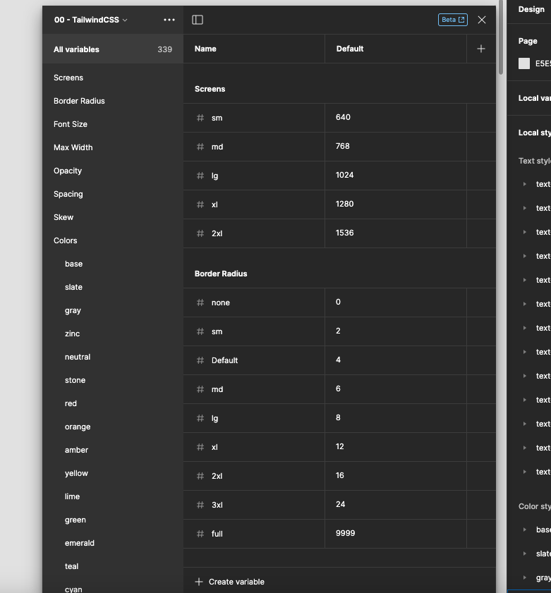
## Types of Variables
There are four types: color, number, string, and boolean. As the name suggests, each type can store values for different attributes. To give you quick idea of what you can do with these,
- Color
- Setting up primary & secondary color from your palette
- Switching between light & dark mode
- Number
- Changing the width and height of content, including padding, on the fly based on device size
- Changing spacing & gap of the text
- Setting up primary font size
- String
- Instantly changing all the strings in the design
- Boolean
- Being able to toggle between 'ture & false' makes it a popular choice for any 'on & off' functionality
In conclusion, variables are a tool for advanced prototyping of UI designs.
## How to Use
Variables can be created by default in the right sidebar under 'Local variables'. When you click the Local variables tab, the new window where you can create a variable will pop up.


There are several steps I want to share to building a prototype system.
1. Creating Variables for Breakpoint
'Breakpoint’ is the basic variable group organized by screen size. I usually make 4 groups of screen size: Mobile, Tablet, Laptop, Desktop.
Because screen sizes are 'number', you need to choose number to create the variable.


2. Creating Components
Components are the most basic and repetitive design items that make up your site, such as buttons, headers & footers, menus, and sidebars.
Here's an example of creating a button prototype with variables.

It's a good idea to create a default design like this for components that are used consistently on a homepage, such as buttons. If you set the size of the button to variable, as shown in the photo above, the button will automatically update its size based on the variable algorithm you've already created.
This is useful because we have a width based on the screen size that we set earlier, so wherever the button is placed, the width will automatically change based on the screen size.


Similarly, margins and padding, and even the color of buttons and text can be specified as variables.
## Conclusion
It may seem like a complicated process, but once you've prototyped something like this, future design updates will be a breeze. You don't need to update each component, you just need to make the modification in the variable or modify the prototype it's referencing, and everything else will be fixed automatically.
In my practice, I've gotten a lot of benefit from creating components and variables for repeatedly used design elements like buttons, cards, headers, and footers. It's obviously an update that Figma is working hard on, as it's working well in the hands of current users. The update I'm most looking forward to is probably the variable package plugin. If we can do that, we won't have to prototype like this anymore. Of course, I don't know if it would be free:)
In this post, I've tried to give you a quick introduction to variables. In practice, it's actually more complicated than that. I couldn't write it all down in this post, but luckily Figma has a really detailed and easy to understand explanation on their YouTube channel. I've provided links below that might help.
- Intro to variables
- Basic understanding of variables
- Creating variables
- Creating decorative variables (styles)
I hope you found this post helpful. Happy designing!